Stand in the doorway between a living room and a terrace and watch what happens. Most people hover. They step one foot out, look around, step back in. It's a strange little dance — and it's never the furniture's fault. The problem is the threshold itself: a step down, a different material underfoot, a hard visual line where the wall ends and the sky begins. When I first started sketching additions for clients, I assumed the fix was a bigger door. It isn't. The fix is making that imaginary line disappear, and that's what good indoor outdoor flow is really about.
Over the past few years I've drawn and re-drawn enough of these transitions to know that the money rarely goes where people expect. A client of mine spent close to $18,000 on a folding glass wall, then called me two months later because the room still felt sealed off. We fixed it for roughly the price of a weekend of carpentry. More on that below. First, the principles.
Key Takeaways
- Flow is created by continuity — level, material, and sightline — not by the size of the opening alone.
- A flush threshold of 10 to 15 mm does more for the connection than a door twice as wide.
- Overhangs, wind, and drainage decide whether the space is actually usable; aesthetics come after.
- Raising the finished floor level by even 100 mm can destroy the whole effect.
- Plan the transition during the design phase, not after the structure is up — retrofitting costs roughly double.
The single biggest mistake in indoor-outdoor flow design
It's the step. That 150 mm drop from the interior floor to the exterior slab, which nearly every builder installs by reflex, quietly tells your body "you are leaving now." And your body obeys.
I'll admit I got this wrong on my own house. The plans called for a standard threshold because it made waterproofing simple, and I let it slide. Six months later I realised nobody ever sat on the patio. We were using a $4,000 set of outdoor furniture as decoration. When we finally rebuilt the transition with a flush sill and a continuous deck board, the same room started getting used every evening. Same furniture, same view. Different threshold.
What actually breaks the flow
Walking through projects, I keep finding the same four interruptions. Any one of them is enough to kill the connection on its own:
- A vertical step of more than 20 mm between interior and exterior finished levels.
- A change in floor direction — timber running one way inside, the opposite way on the deck.
- A narrow pinch point at the door: anything under 900 mm clear width feels like a hatch, not a passage.
- A visual barrier in the middle of the sightline — usually a screen, a post, or a badly placed outdoor heater.
Notice that none of these is about style. You can have the most beautiful material palette in the world and still fail on a 30 mm lip.
Why architects keep repeating the step
Because water runs downhill, and builders hate callbacks. A raised interior floor is the easy way to guarantee that rain never reaches your timber. That instinct is reasonable — it just produces a worse building. The way out is to lower the exterior slab during the design phase, and to detail the drainage properly underneath. It costs more up front. It also removes the single biggest barrier to actually using the space, which is the whole point of the exercise.
Indoor-outdoor flow architectural design tips that move the needle
Here's the thing: the wide opening is the least interesting part of the job. Almost anyone can specify a big slider. What separates a transition that works from one that merely looks good in photographs comes down to a handful of decisions, most of which are made quietly on the drawings and never discussed again.
Make the floor do the work
Carry the same material across the threshold, or at the very least the same direction and tonal family. A continuous board running through the opening creates an optical illusion that the room extends further than it does. When I redid a small courtyard house two years ago, we used the same stone inside and out with a 12 mm gap at the sill for drainage. Visitors kept asking whether the courtyard was part of the living room. That's the goal.
If you can't use the literal same material — and with timber you often can't, because UV and moisture behaviour differ — match the tone and the module width. Running a 140 mm indoor board into a 200 mm outdoor tile is a visual stumble you'll notice every single day.
Control the ceiling line
Interior ceilings tend to be around 2.4 to 2.7 m. Exterior soffits are often lower, and that sudden drop reads as a cave mouth. Push the exterior overhang up so it lines up with the interior ceiling, or at least gets within 100 mm. This is one of those details nobody consciously notices and everybody feels.
Use the overhang as a room
Deep overhangs are usually discussed in terms of sun control. They're also the cheapest way to add usable outdoor area, because a covered zone is usable in light rain and in summer glare. For a temperate climate, a depth of roughly 1.2 to 1.8 m shades midday summer sun while still letting low winter sun through — though that figure shifts a lot depending on which direction the opening faces.
Get the drainage detail right early
Flush thresholds mean water management becomes a real engineering question rather than an afterthought. You need a linear drain set within a few centimetres of the opening, a continuous waterproofing membrane that crosses the sill, and a fall away from the building of at least 1.5 to 2 percent. I have watched a beautifully executed flush sill turn into a damp patch at the base of a wall because the fall was 0.8 percent. Water finds the argument it needs.
Plan the light in layers
Two different lighting schemes on a single sightline will always break the illusion. If the interior is warm at 2700 K and the terrace is cool white, the threshold reappears at night. Match the colour temperature, and dim both on the same circuit if you can. It's a small electrical decision with an outsized effect on how connected the two zones feel after dark.
Furnish across the line
The most underrated trick in the whole business: put one piece of furniture that straddles the transition. A bench that starts inside and ends outside. A rug that runs under the door. An outdoor sofa facing back into the room rather than out at the garden. Psychologically, it tells everyone that this isn't a boundary at all.
How to create an indoor/outdoor space without a renovation
Not everyone can lift a floor. If you're working with an existing step, you can still recover most of the effect with things you control directly.
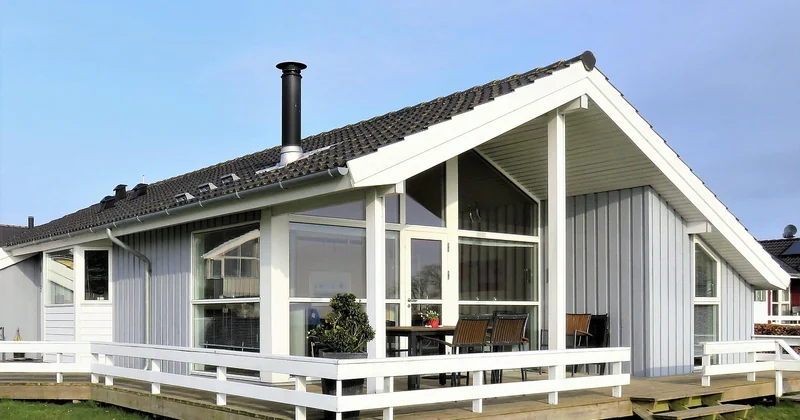
- Remove the door leaf where the climate allows. An open aperture reads completely differently from a closed one, even at the same width.
- Match the floor tones with a large outdoor rug that visually extends the interior colour.
- Repeat one material — the interior timber tone, the tile, the paint colour — on the exterior wall framing the opening.
- Move the heaviest furniture off the wall opposite the opening, so the sightline stays clear.
- Add a lightweight screen or planting at the far end of the outdoor zone, which gives the eye a destination.
None of this is a substitute for the flush sill. It's damage control, and it works better than you'd expect.
| Approach | Relative cost | Effect on flow | Maintenance load |
|---|---|---|---|
| Flush threshold and continuous floor | High (structural work) | Strong — eliminates the step entirely | Low, but drainage must be right |
| Large sliding or folding glazing | High | Moderate on its own; strong combined with a flush sill | Regular track cleaning |
| Deep overhang or covered terrace | Medium | Makes the space usable in more weather | Very low |
| Matched materials and lighting | Low | Noticeable, especially at night | None |
| Furniture placed across the threshold | Very low | Modest but immediate | None |
Where indoor-outdoor transitions actually fail
Wind. Everyone plans for sun and forgets wind. A west-facing opening in a coastal location can be unusable from mid-afternoon simply because of pressure differences, no matter how elegant the glazing is. I've seen owners install a $30,000 opening system and then eat indoors every evening.
The fix is usually cheap and unglamorous: an L-shaped return wall, a planter of dense low shrubs, or a slatted screen perpendicular to the prevailing wind. On one project, a 1.8 m screen panel solved what a full glazing upgrade could not. The client wasn't thrilled about spending on a wall instead of glass. She was thrilled by August.
The second failure point is acoustics. A large opening carries traffic noise straight into the living room, and that's the one thing glazing does extremely well. If you're near a road, it's worth testing the ambient level before committing to a completely open plan.
What are the 7 stages of architectural design?
These are the stages you'll move through on a project: pre-design (brief, site analysis, budget), concept design (massing, orientation, the big moves), schematic design (plans and sections refined), design development (materials, structure, systems), construction documents (the technical drawings a builder works from), tendering and negotiation (pricing and contractor selection), and construction administration (site supervision through to handover).
The indoor-outdoor decision belongs in the first two. By design development, the floor levels are effectively locked, and you're negotiating variations with a builder who has already poured concrete.
What are the 7 basic principles of architecture design?
Balance, proportion, rhythm, emphasis, unity, contrast, and scale. They sound abstract until you apply them to a threshold. A flush sill is really a question of unity — the two zones read as one. A repeated floor module is rhythm. Matching the overhang to the ceiling line is proportion. And a piece of furniture crossing the boundary is emphasis, telling the eye where the new centre of the room is.
What are the 5 stages of the architectural design process?
A shorter version of the same sequence, used on smaller residential jobs: briefing, concept, developed design, documentation, and construction support. If you only remember one thing about how these map onto flow, make it this: the transition between inside and out is a briefing-stage question. Bring a photograph of a space that works, bring your site plan, and bring your honest answer to how you'll use it in February, not just in July.
The threshold is the whole project
Clients talk about the view, the kitchen island, the timber ceiling. Then they live there, and what they actually experience is a 12 mm line under their feet.
I've stopped treating the threshold as a detail drawing. It's the first thing I resolve now, before the massing is even finished, because it constrains everything downstream — slab levels, drainage, structure, budget. Get it right and the rest of the house feels generous. Get it wrong and you'll spend years stepping out and stepping back.
One last thing worth sitting with. The best indoor-outdoor connection I've ever built was in a house with no large opening at all. The whole wall was solid, and the terrace sat under a deep roof. It worked because everything lined up: floor level, board direction, light colour, wind protection. The opening was almost incidental. Which makes you wonder how much of what we sell as "connection" is really just glass.